Communication Design Fundamentals
Project 4 | Poster Series
Posters follow us everywhere, from the advertisements on the sidebar as we browse websites to the event posters seen on public transportation promoting the hottest summer festivals. The design of a poster needs to be eye-catching and relay all relevant information clearly in order to promote its topic most efficiently and successfully. The composition process of a poster ties together all the principles addressed in earlier Projects, including gestalt principles, hierarchy, typeface design, while also incorporating newer principles such as color theory.
(10/22) Adobe Illustrator Exercises




Poster Ideas
Governor’s Ball 2021
When: June 4–6, 2021
Event Type: Annual Festival/Concert
Location: Randall’s Island, New York City
Description:
The Governor’s Ball Music Festival is an annual music festival that typically occurs on the first weekend of June. It is produced by Founders Entertainment, and features a variety of A-list headliners as well as popular NYC food trucks and restaurants, as well as activities and games.
Inspiration (previous years’ posters):

(10/27) Class/Homework:

Event Context:
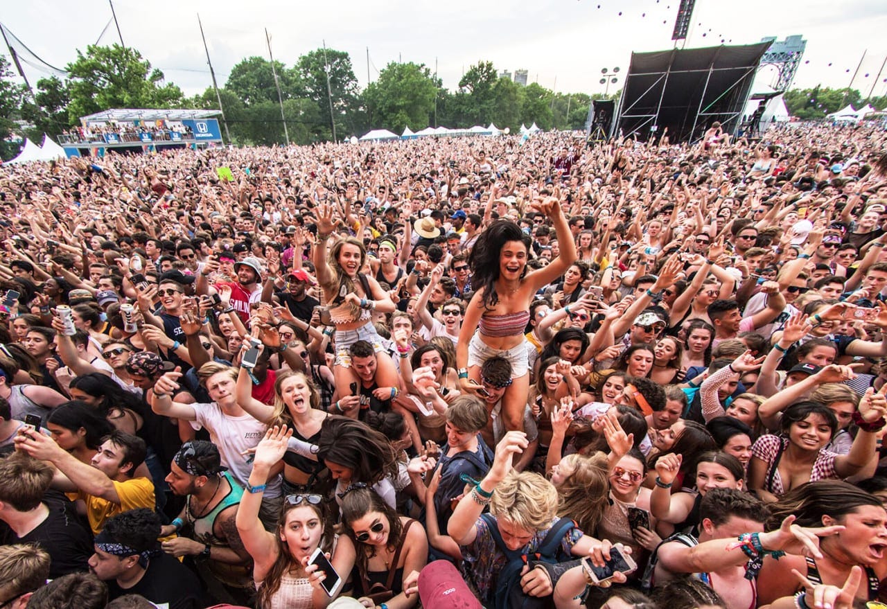
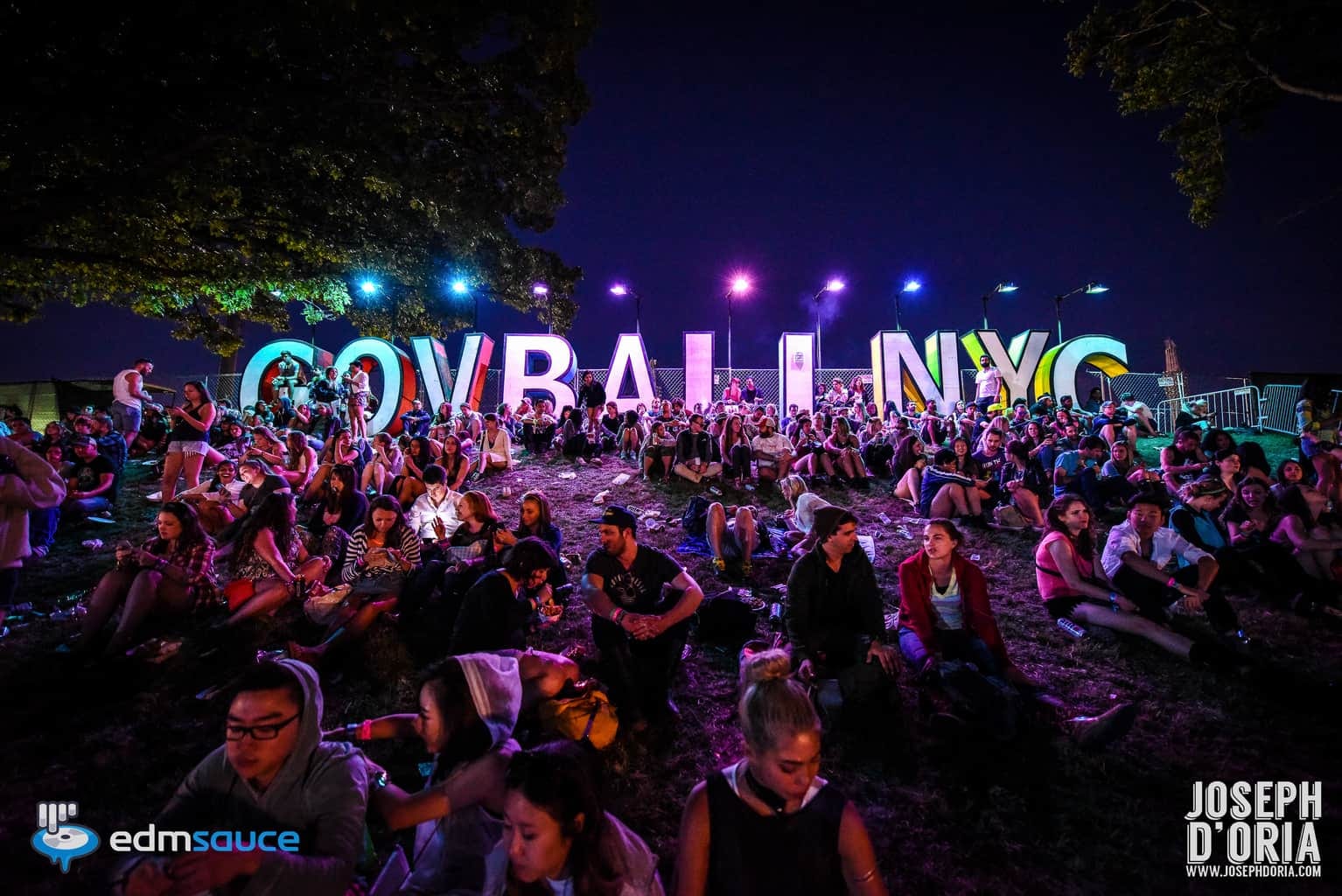
The Governor’s Ball (GovBall) occurs annually at Randall’s Island, NYC, and is famous for its loud and hype atmosphere. Its A-list headliners continually attract denser crowds each year, and tickets are known to be cumbersome to acquire due to its popularity.
GovBall is loud, bright, and colorful, and these attributes are shown through their illustrative posters, of which one year’s is never like the last. The names on the poster are packed, just like the crowds for the shows. This often compromises legibility. I hope to address the issue of legibility through my designs while also continuing to accurately represent the playful quality of GovBall.
Idea/Typeface Exploration & Development:

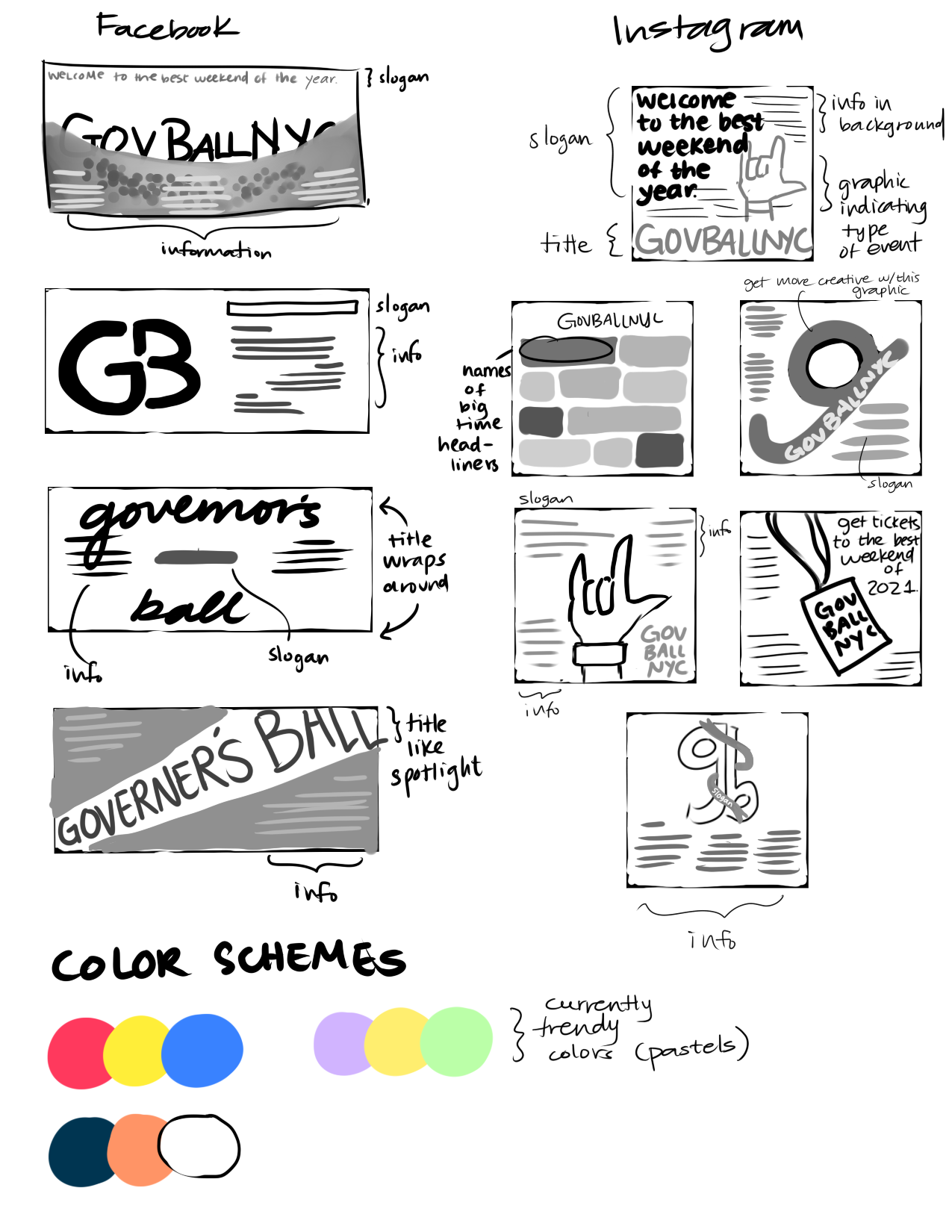

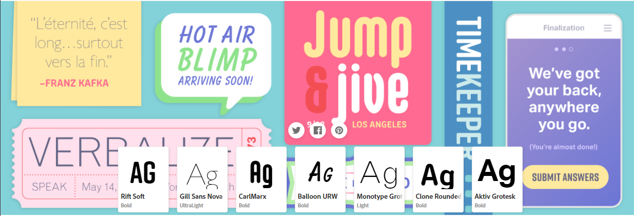


Design Intention:
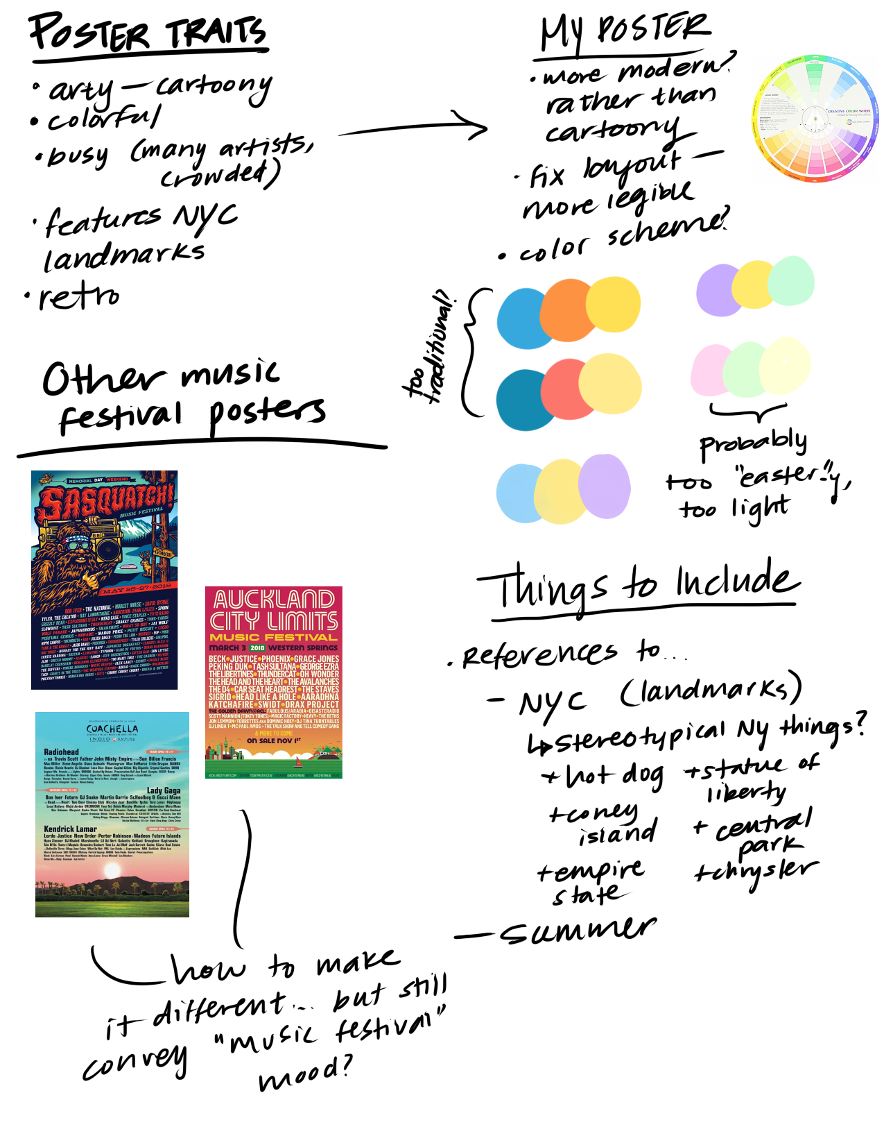
I want the poster to express modernity and the social media/viral/ community/almost edgy atmosphere that comes along with an event of this nature. Consequently, for the potential event name typefaces, I was drawn towards non-traditional, more playful typefaces. These typefaces also stick more to the music festival poster meta, which is more artsy and busy. At the same time, I want the poster to remain neat and modern, so for the information typefaces I explored cleaner sans serif fonts.
Feedback & Mock-Up
- Hand/ticket motif is stronger of the choices
- Use a handwritten/sketchy typeface to match with hand motif, as well as keep “artsy” music festival ambiance
(10/29) Class/Homework
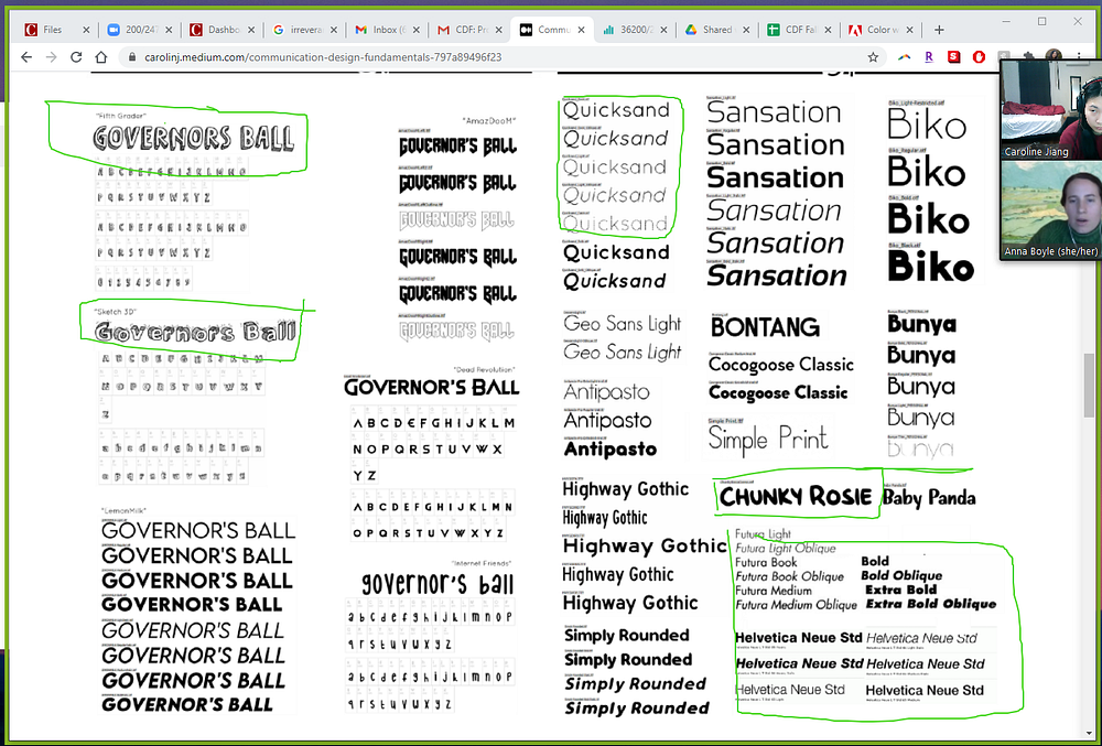


Critique Notes:
- Handwritten fonts are more effective for the title, and are better for the concept (see: “Sketch 3D”, “Chunky Rosie”, “Fifth Grader”)
- Rounded, sans serif fonts are more effective for a cleaner body, and bring a cleaner vibe to the poster when juxtaposed with the handwritten title (see: “Quicksand”, “Futura” (font family), “Helvetica” (font family))
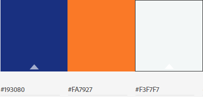
- Stick to 2–3 colors for the color scheme
(11/3) Home/Classwork:


Design Intention:
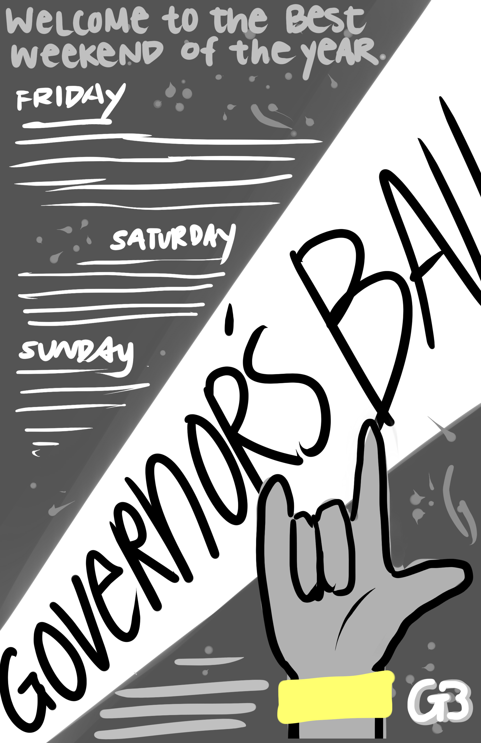
The motifs most associated with the Governor’s Ball are usually their exciting and illustrative posters (which attendees collect as souvenirs), the tickets/wristbands, and the hype and heated summer atmosphere in which the festival usually takes place. GovBall is known to start in the afternoon and last long after the sun has set.
The illustrative quality that is a staple for GovBall posters was taken into consideration when developing the potential layouts. The first design touches on the motif of an “access ticket” that event-goers can easily recognize and associate with the festival, while also adding a sense of urgency that encourages the poster reader to get a ticket before they sell out. The second design features an illustration of a hand holding up hand-horns, which is both associated with music and also the symbol for love in sign language. The wrist of the hand has a wristband on it, also bringing in the ticket symbol. In the background, a spotlight shines into the night sky, alluding to the late-night party atmosphere of the event.
(11/5) Home/Classwork:


Design Intention:
The main motifs used in the design of the poster are the tickets, on which the festival lineup is written, and the famously long hours of the festival, which is represented by the sunset-colored backdrop. There are twinkling stars near the top of the poster to show emphasize day turning into night, as well as add playfulness. The typeface of the important information (title, date, ticket price) is handwritten. There are line triplets that surround the important information to draw the eye towards it.
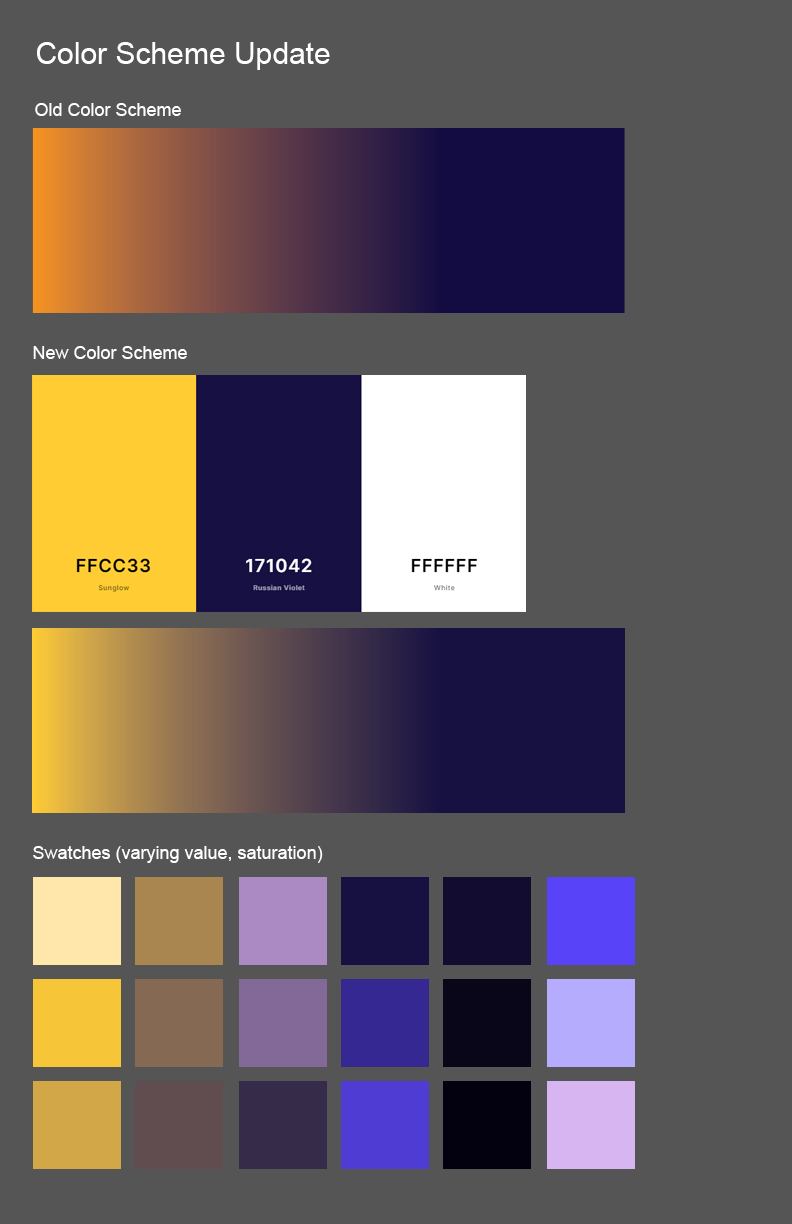
The color palette is based on this sunset theme, with one end of the gradient being midnight blue and the other being a orange-yellow sun color. There are some interesting mediums created when the color is blended (such as these pretty, lighter pastels) that can be incorporated in further iterations of the poster.
Critique Notes:
-Make the “music festival” theme clearer, as the designs currently lack a clear indicator that the event is a music festival
- Balance the content with the concept
- Add illustration or visual representation to make festival concept clearer
I liked how you used hand-drawn style for the event title!
Consider not repeating the same information. Also, it seems like some elements are missing: location of the event, how to get the tickets?
Peer Critique:
I really like the illustrations you have made. They are very pretty and suit the concept well. I think that maybe you could play around with information such as date/time and price as I think that they’re in awkward places right now.
I wish the hierarchy were a little bit stronger; the tickets are about the same size as the title, so they kind of blend together.
I like how easy it is to find the important information (large text) on the poster. I wish the denser text was more spread out because at first glance I skip over the text due to the heavy content.
(11/10) Home/Classwork


Design Intention:
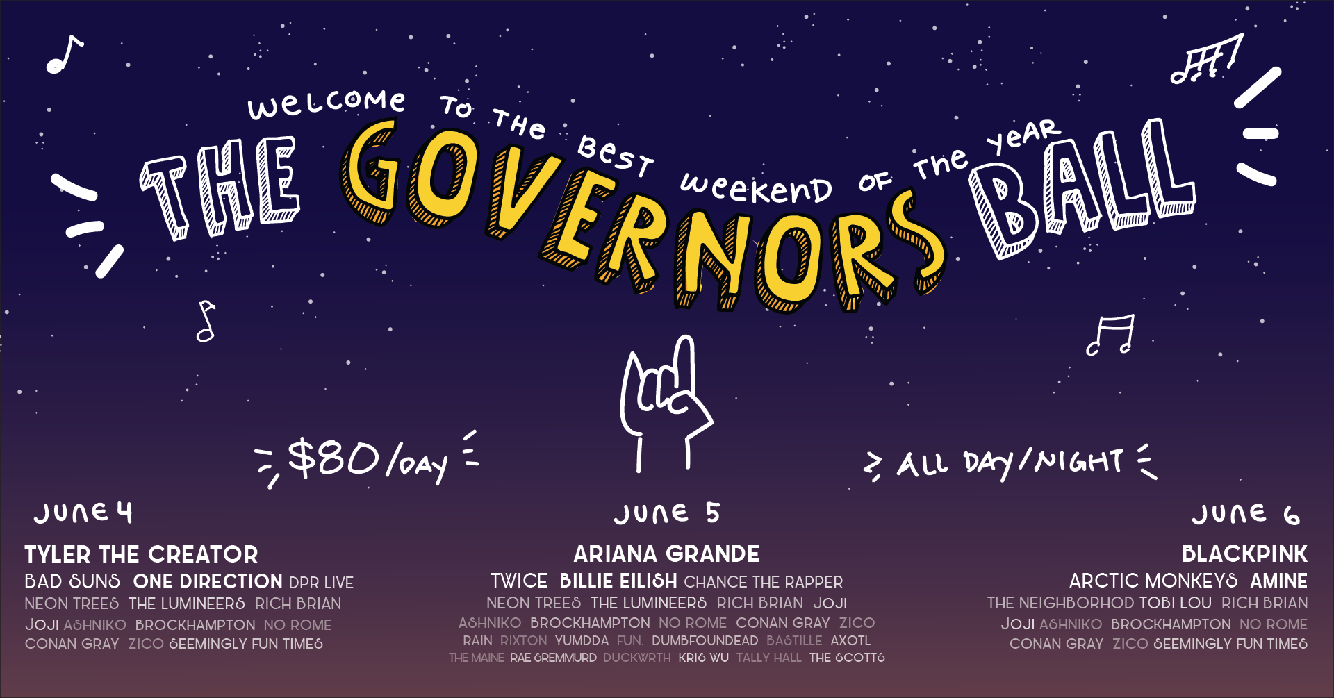
Taking into consideration last class’s critiques, music notes and the hand-horn symbol were added in order to more clearly express the nature of the event. These symbols were also used in the Facebook and Instagram ad versions of the poster. For the Instagram Ad, I experimented with using the slogan as the main pulling point of the poster, thinking that perhaps an Instagram user casually scrolling through their feed may be curious about what the “best weekend of the year” is going to be.
Critique Notes:
- Fill in missing information (paragraph, time, date)
- Information can be organized better (eg, time closer to date)
- There should be consistency with the motifs/tagline/illustrations between the 3 designs
- For the Instagram ad, the slogan shouldn’t be the largest piece of information on the design
(11/12) Home/Classwork

Logo Redesign:
My first iteration of the Governor’s Ball logo/main illustration used a pre-designed typeface that resembled handwriting. I really liked how it looked, but because it was a predesigned typeface, I was somewhat limited by the amount of change I would need to implement to get it just to how I wanted it. Also, although the 3-D effect was playful and fit the direction I wanted the poster to head in, it also added additional clutter.
My redesigned poster was made using the pen tool. It retains the handwritten quality, but doesn’t have the depth/shadow that I felt brought additional and unnecessary noise to the design composition. The color scheme was also updated to incorporate the more yellow tone used in the logo.



Design Intention:
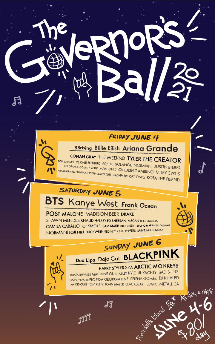
I wanted the important information, such as the location, ticket price, and event times to be in the same typeface/type style as the logo. This is because this type of information (event name/location/ticket price) is the most important, and therefore should be categorized as so via their typeface. However, I didn’t have a typeface to go by, as the logo was made using the pen tool. I remedied this by creating my own “typeface” by using the pen tool to create letters of the same style, and then copy-pasting them when needed. I made small variations between some instances of the same letter in order to add additional depth and retain that loose, fun, handwritten quality, while optimizing legibility.
The same pen lines were copy pasted across the formats to create unity amongst the designs. This, contrasted with the sans serif font “Futura,” helps give the poster a little more polish and neatness.
A spotlight was added to the background of one of the posters, as this is another motif I am considering incorporating into all the design formats. It also helps emphasize the show/festival motif of the event further.
Critique Notes:
-For the poster, the text at the bottom right corner is difficult to read
-Missing short paragraph
-Missing information about how/where someone can purchase a ticket
-Increase legibility of handwritten-style text
(11/16) Home/Classwork





Design Intention:
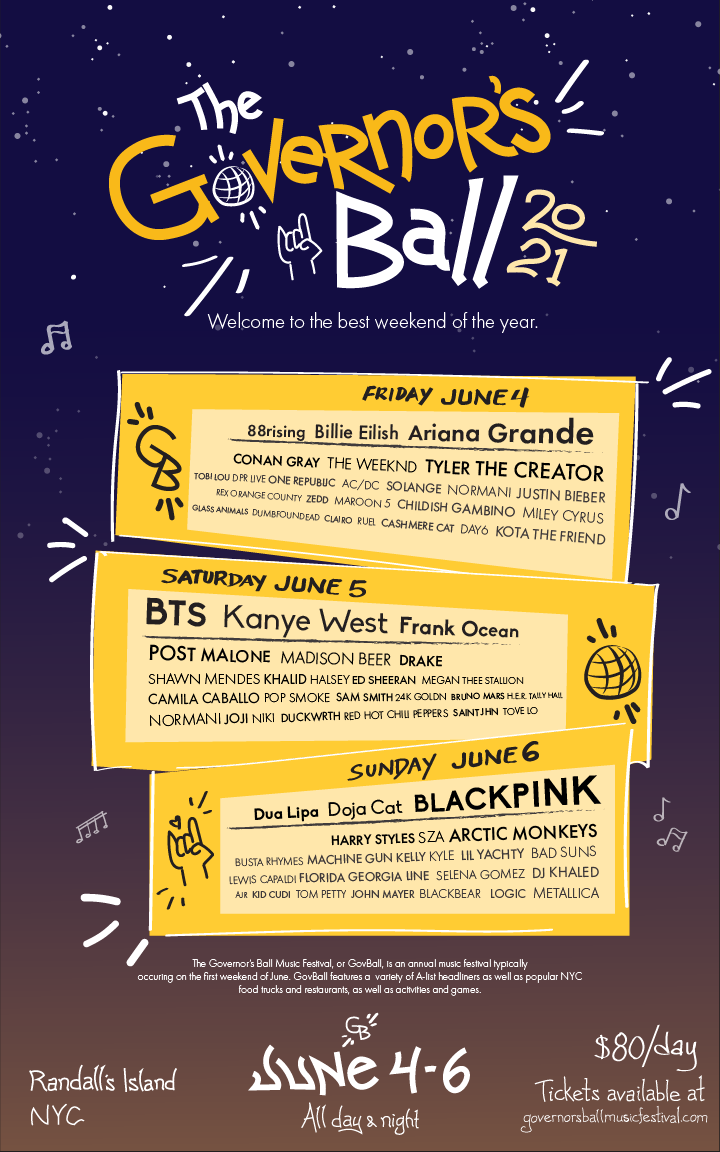
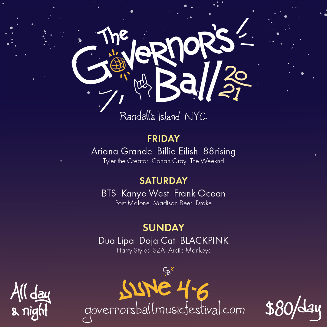
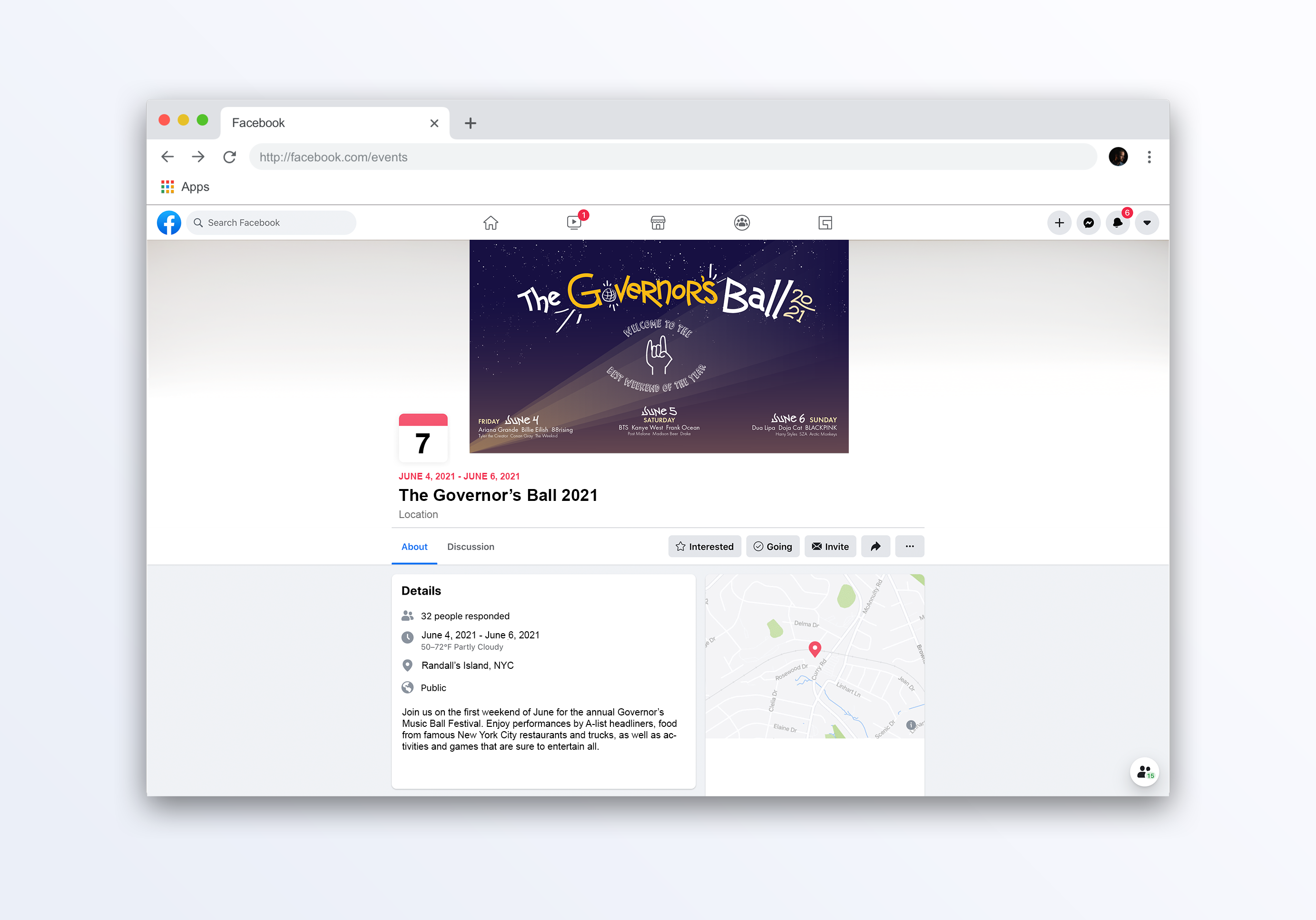
I catered these iterations as much as I could according to the critique I received on Miro. The date/location/ticket information, which was previously placed in a curved format on the bottom right corner of the page, was straightened and put on the bottom. I tried the slogan out in different typefaces, and shifted around its placement based on the suggestions provided by Ji on Miro.
Poster
The one thing I really struggled with was the placement of the event description paragraph. Because of the typical density of the GovBall lineup, and consequently the density of the text that appears on the poster, it’s difficult to find a space where a large chunk of text can legibly fit. A paragraph description is also very atypical of music festival posters, so there isn’t anything to draw reference or inspiration from.
Instagram
I played around with the logo colors and text size of the Instagram ad. I switched the yellow and white colors in “Governor’s” as I thought it looked better in the context of the ad, and also brought an extra layer of complexity to the series of designs. I felt that a smaller size text offered a more aesthetic-looking advertisement, but impacted legibility; alternatively, a larger text size improved on readability but added more clutter. In one of the iterations, I added the spotlight motif that was experimented with in a previous poster design.
Facebook
I tried out two different formats for the Facebook banner. One of them used a similar format as my first attempt at the banner, when I was still using the old logo. My intention with this format is to draw the viewer in towards the “center” of the poster, and provide a feeling that they are being drawn to the event itself. The motif of the hand-horn is represented, and the slogan is placed right in the center surrounding the hand.
The second format allowed for what I felt was a more effective placement of relevant information. The event name/logo is huge and highly legible, and clings to the left edge of the page. The information regarding the time/ticket/location of the event is lined up on the bottom edge, while the artist lineup is stacked neatly on the right side. I feel this format offers a more circular, “sweeping” motion of the viewer’s eye, so that the information is conveyed with ease and effectivity.
The spotlight motif is transferred onto both these iterations as well.
Critique Notes:
Poster
- Shrink main logo by 10–15%; include paragraph underneath that
- Move tagline down, or remove it; doesn’t really explain event
- Remove some of the artists and shrink down ticket size to accommodate for paragraph space, as well as increase overall legibility
-Reorganize some of the information, such as moving the location to underneath the main logo
-Left align and in general align more text/graphics to increase overall legibility
Instagram
-Heavy wording a bit cluttered, consider removing artists and moving that information down into description instead
Facebook
- Left align certain information to increase legibility


(11/17) Final Critique


Design Intention:
Poster
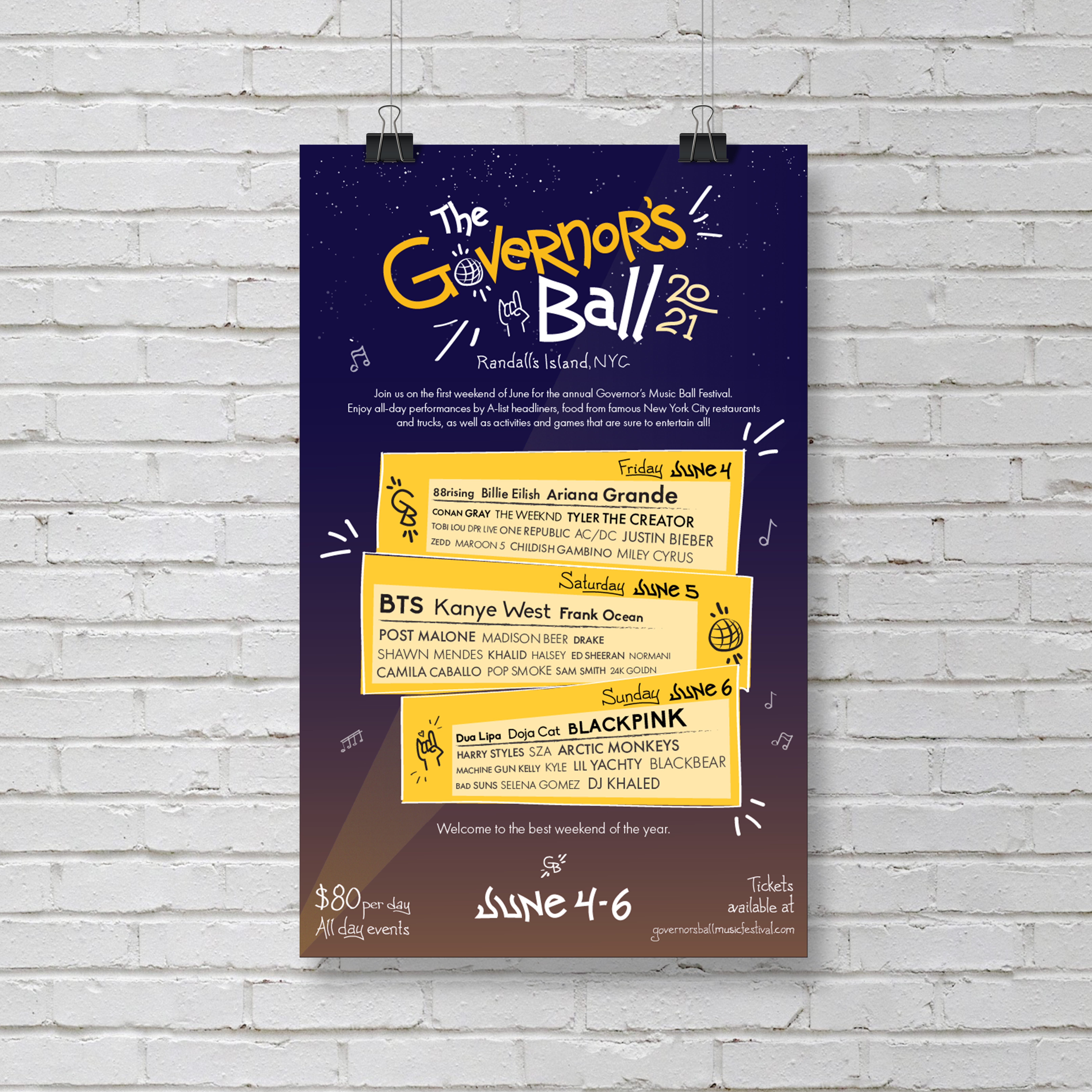
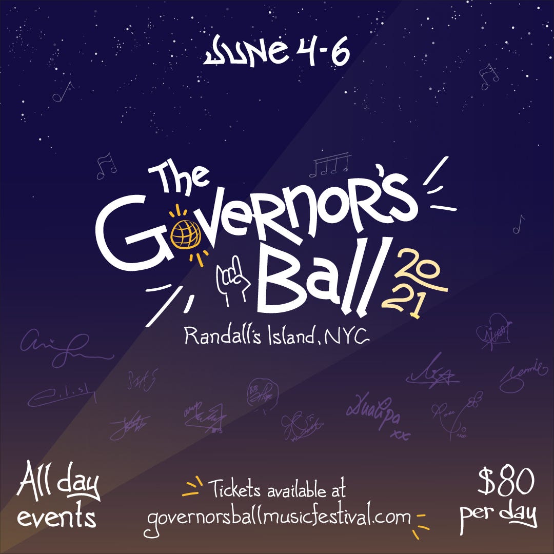
The lineup of artists was shortened to accommodate for space for the paragraph, as well improve overall legibility. The logo was slightly shrunk, and the event location brought up to the top. The spotlight motif was incorporated into the background, bringing unity to across all 3 design formats.
Instagram
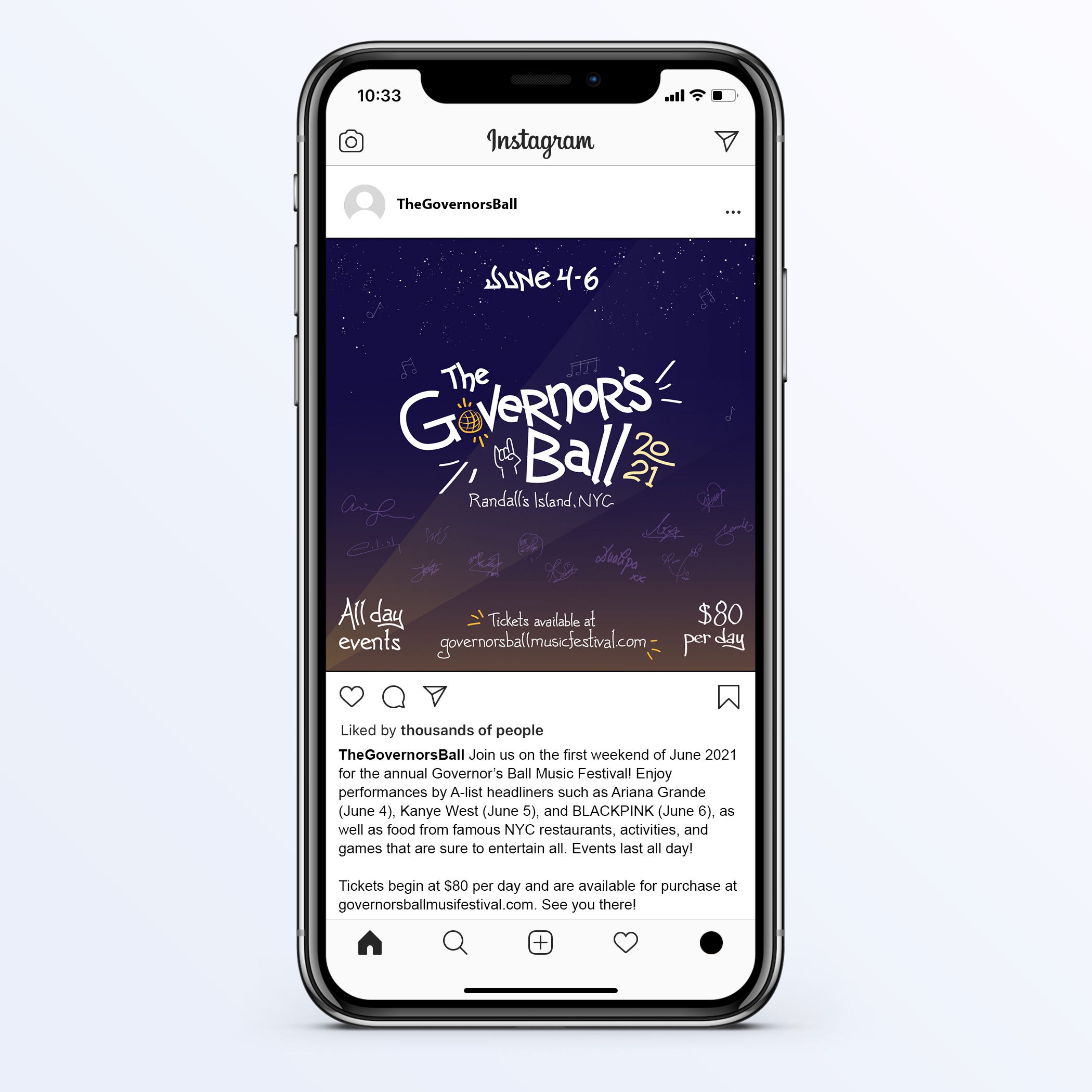
The format of the information was reorganized so that the main feature of the ad is the event name/logo. As an alternative to having a common and repetitive artist lineup, I opted to go for a more creative representation of the headlining artists through their signatures. The autographs of music artists are often cherished, and offer a recognizable representation of them to their fans. If fans recognize the artists, they may be drawn to the event. The lineup information was then transferred to the Instagram description to make the overall layout cleaner, and have the most important information regarding the hosting of the event “pop” out. The music note symbols from the poster were taken and incorporated subtly into the background in order to keep consistency between the designs, as well as make clear the nature of the event.
Facebook
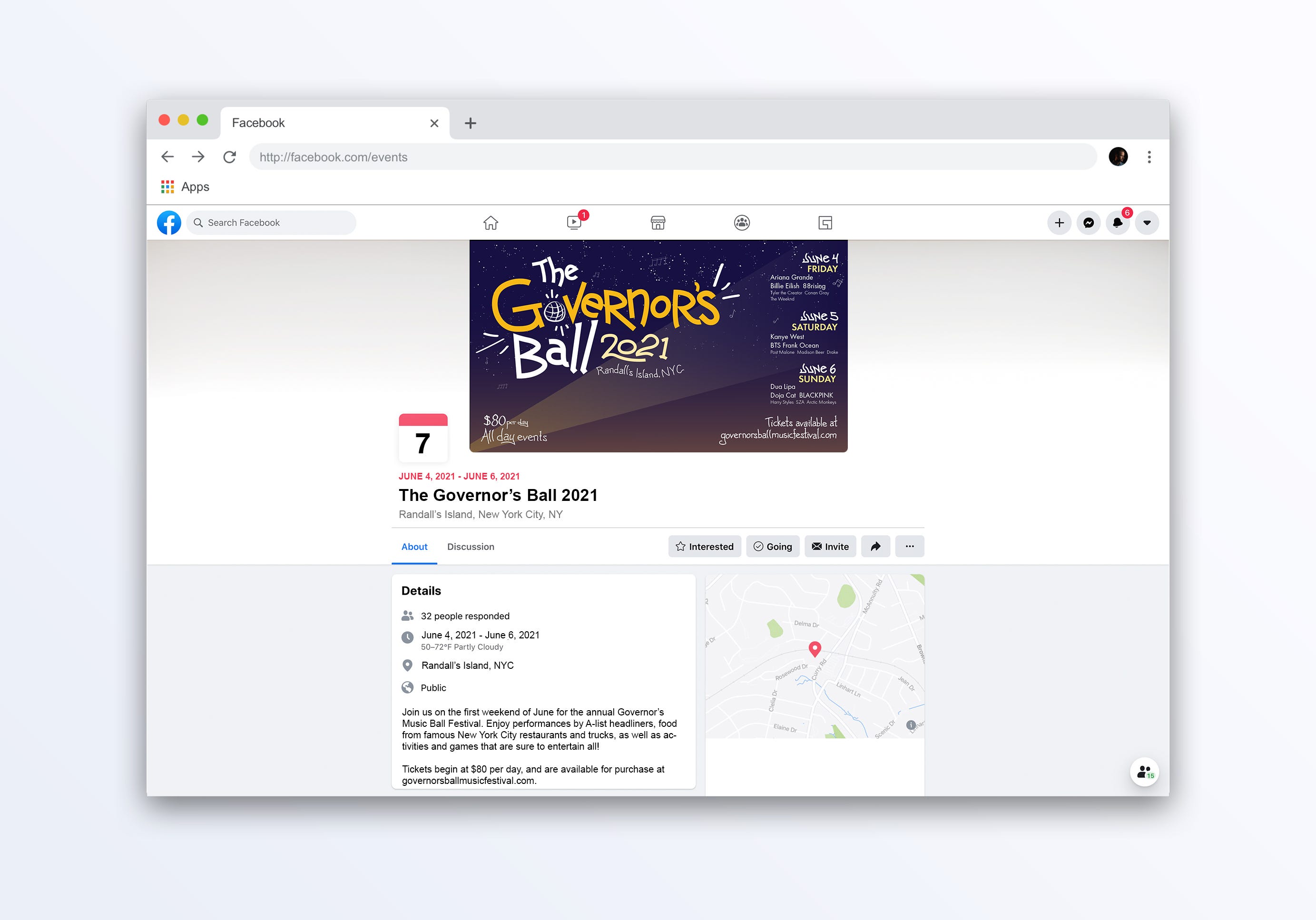
The text with the artist lineup was left-aligned to increase legibility. The event name was incorporated into the logo in a playful manner to retain the hype, handwritten theme of the design. The music note symbols were incorporated into the night sky background of the Facebook banner as well.
Reflection
This project was an incredibly fun and informative adventure. Although we were tasked with poster creation, similar to the previous project, I felt it was an entirely different experience.
I loved how I was able to choose my own event for this project. It allowed me to explore events that I was personally interested in, and brought a new level of investment into the research and design process. All the information about gestalt principles, hierarchy, craftsmanship, and intention that we learned from previous projects was kicking in, and definitely helped me throughout my iterations. It was really cool to put all the new skills I learned into action, and made me even more excited about the project process.
Having much more frequent group reviews was incredibly helpful. Looking to see what types of events other people picked and the methods through which they chose to represent them was not only impressive to view, but was also inspiring for my own work. Receiving both positive and negative feedback from my peers was invigorating, and pushed me to continue to make additional changes and explorations throughout my iterations. My favorite part was definitely seeing the diversity of the different types of posters, and recognizing the amazing talent that was present in the Zoom call.
One thing I struggled with was balancing the project rules and guidelines with the accuracy of the event. Typically, for my event, the artist lineup is very dense. It’s one of the main selling points of the event. The posters are known for their cluttered, messy, and highly illustrative nature. I ended up having to cut down on the lineup for the purposes of the project in order to increase legibility in my poster. Furthermore, the event is advertised mainly through its virality and by word-of-mouth. In my first iteration of my Instagram ad, I had the slogan as the largest piece of featured text, because I felt it fit best with this type of viral, grab-your-attention advertisement. However, I began overcoming my difficulty when I looked at my design through a new lens. I began altering my designs so that, instead of being catered to the targeted audience that may already know what the vent is, it was instead addressed to someone completely unfamiliar with the event. This helped me more effectively find the balancing point I was struggling with.
Project 4 has been my favorite project thus far, and being able to utilize the culmination of all the skills we’ve acquired throughout the class has been such a cool experience. Seeing the diversity of everyone’s brilliant design minds is a unique experience to this class. I love the environment and energy we’ve created in this studio, and am excited for the last project to come!
