Communication Design Fundamentals
Project 5 | Digital Spread
Magazines, newspapers, and digital spreads are all forms of media of which organization and composition are vital to its legibility and success. This project will make use of the culmination of skills learned from previous projects, including gestalt principles, hierarchy, craftsmanship, intention, and typeface design in order to deliver a magazine spread that is aesthetic, functional, and which effectively communicates relevant information.
(11/19) Grid Exercise


Magazines typically use a grid system in order to clearly organize and deliver information. This exercise helps break down the underlying grid format in order to improve understanding of the formatting of digital spreads.
Inspo:
I am currently in the process of looking through National Geographic magazine articles.
https://www.nationalgeographic.com/adventure/2018/10/flood-escape-deepest-cave-veryovkina-abkhazia/
https://www.nationalgeographic.com/magazine/2018/08/butterfly-catchers-collectors-indonesia-market-blumei/
https://www.nationalgeographic.com/science/2018/10/news-sputnik-world-space-week-soviet-union-russia/
(11/24) Brainstorm
National Geographic was one of my favorite magazines as a kid. I had a subscription to National Geographic Kids! for the longest time, and even then, I eyed the “official” National Geographic magazines with envy. They seemed grown-up, always addressing more pressing matters like global warming and drug trade and the possible extinction of certain species. This, along with the fact that the contents of their text were just a little too difficult for me to completely understand back then, made the magazine all the more alluring to me. Even if I couldn’t always understand exactly what the paragraphs next to the pretty pictures in National Geographic spoke about, I would love looking at the brilliant illustrations and exciting photographs.
Recalling my experience with National Geographic as a child, I want to produce a spread that features pages which adhere to the graphic quality of the magazine. These pages typically feature a compelling hierarchy of art, diagram, and information.
For the spreads which feature texts, the information is typically aligned to a traditional grid design. The photo is either on one page, and the text on another, or one of the two is offset slightly to just go over the page it is on.
These types of pages in National Geographic are The pages that are highly illustrative or photographic in National Geographic are often compelling and have a hierarchy of art, diagram, and information. However, typically, the photographs are rectangular in shape and placed in the typical grid format. I want to create a spread in a style that more closely aligns with the format of National Geographic’s more graphic pages.

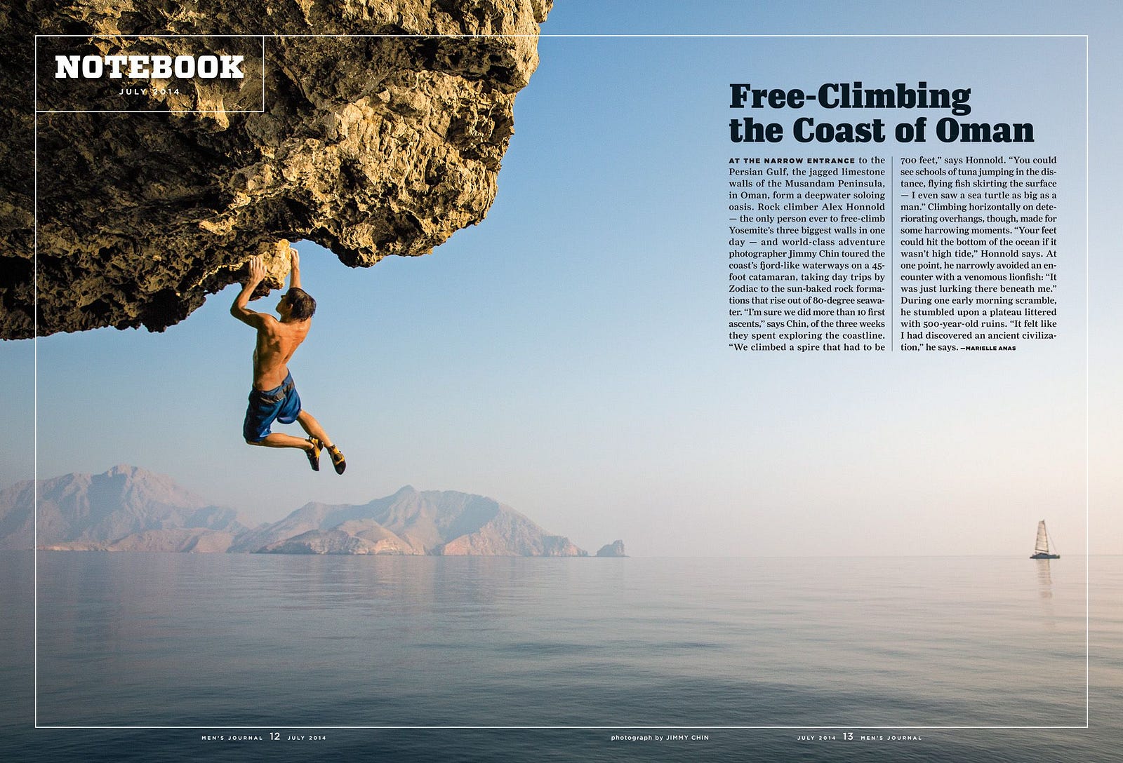


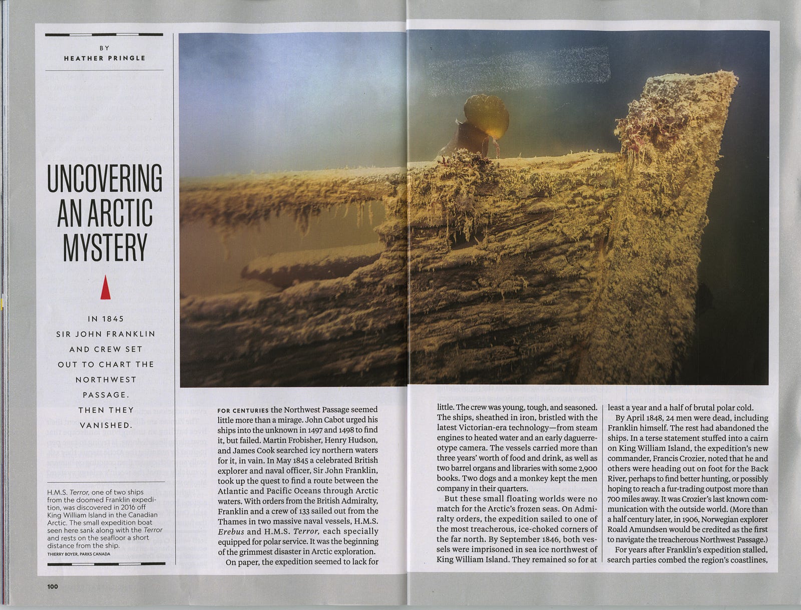

The formatting of the information, as well as the decision to slightly shift either the image or the body of text over onto the next page, gives the magazine a recognizable and elegant quality.
National Geographic typically follows either a double or triple column spread format, and uses color blocking or rectangular photos/subheadings/text boxes to help break up the page. I will take these into consideration in creating spreads that stay most true to the nature of the magazine.
Article Choice
I chose the article “Inside the Murky World of Butterfly Catchers” by Matthew Teague. I felt the article discussed a unique topic that I hadn’t really known about prior to this project. Typically with articles regarding butterflies, they’re viewed through a more novelty optimistic lens. The articles always seem to be either on the “trademark” Monarch butterfly, discussing their lifespans and migration patterns. However, this piece brings a new perspective on the interactions between people, economics, culture, and butterflies. It discusses butterflies through a more controversial lens, which I appreciated and was drawn to.
Thumbnail Sketches

National Geographic is known for displaying its famously exquisite photography over the magazine’s double-spreads. For my title spread, I want to continue this motif in order to stay as true as I can to the nature of the magazine. Therefore, I want to either find a beautiful photograph of butterflies that encapsulates the message behind the chosen article and put that photo across two spreads. I either want to weave the text between the focus of the photograph (depending on the format of the subjects in the chosen image), or place it in either a triple-column or overlapping box format, which I’ve observed is typical of National Geographic’s spreads.
National Geographic’s articles themselves typically densely explore more serious topics pertaining to culture, history, and environmental issues. Thus, the articles are typically very text-heavy, and the one I have chosen is no different. In order to include as much of the article as possible and emulate the text-heavy “feel” of National Geographic spreads while boosting legibility, I will explore either the triple or double column composition that I have observed is typical of their magazines. I noticed that a hallmark feature of National Geographic spreads is that they like to put a photograph mostly on one side of a spread and have it “bleed” over onto the other side, as seen in the second thumbnail sketch of an article-style spread. Thus, I definitely want to incorporate this formatting into my spreads because it stays very true to the grid system of the magazine.
(12/1) Iteration I, Group Critique

Design Intention:
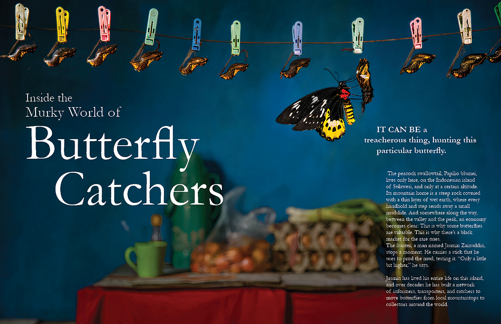
For the first iteration, I attempted to follow through with the ideas developed in my thumbnail sketches as much as possible. The big image I used for my main spread was taken from the article itself. For the title, I slightly offset “Catchers,” as I observed National Geographic likes to get a little bit playful with the formatting of their titles/subtitles/subheadings. I continued this slightly “off” formatting for the subheading on Spread 1 Page 2. I used right-aligned white-on-color text, so that the beautiful shot could be displayed in its entirety.
For the Spread 2, I created a subheading “block” in order to preface the rest of the article. I also incorporated the image bleed-over that I featured in my thumbnail sketches.
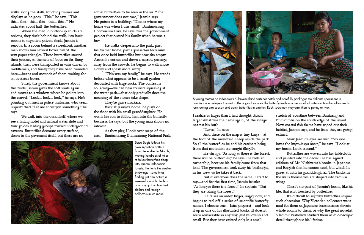
For Spread 3, I emulated the text-heavy formatting of the magazine and the sometimes boxy placement of the photos. I chose a sans serif font for the captions, which I felt emulated the vibe of National Geographic more truly, and also allowed the text to be read a little easier.
The text density is something I am struggling with. There are not many breaks in the article itself, and I’m not exactly sure how to manually break it up while staying true to the intention of the article. Furthermore, the formatting of article-style National Geographic spreads can read as boring and boxy, as it is balanced by full-spread photos throughout the rest of the magazine. This is something I’m struggling to balance within just 3 spreads. I plan to incorporate color and give the article-style, text-dense spreads a little more life. However, it is a bit of a challenge to use the colors to improve the legibility without accidentally distracting from or subtracting from it.
Critique:
- Consider using colors selected from the images of butterflies
- Adjust the letting of the content, and look at how the text is reading
- Incorporate butterflies coming from the edge of the page, flying onto the page
- Get more artsy, use colors and subheadings to break up the dense text and build hierarchy
- Break up some of the heavy text with subheadings, hierarchy and color
(12/3) Iteration II, 1-on-1 Critique

Design Intention:
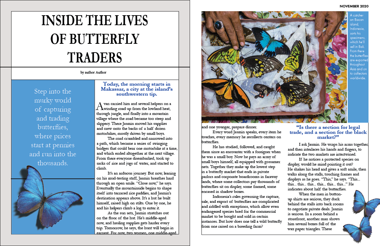
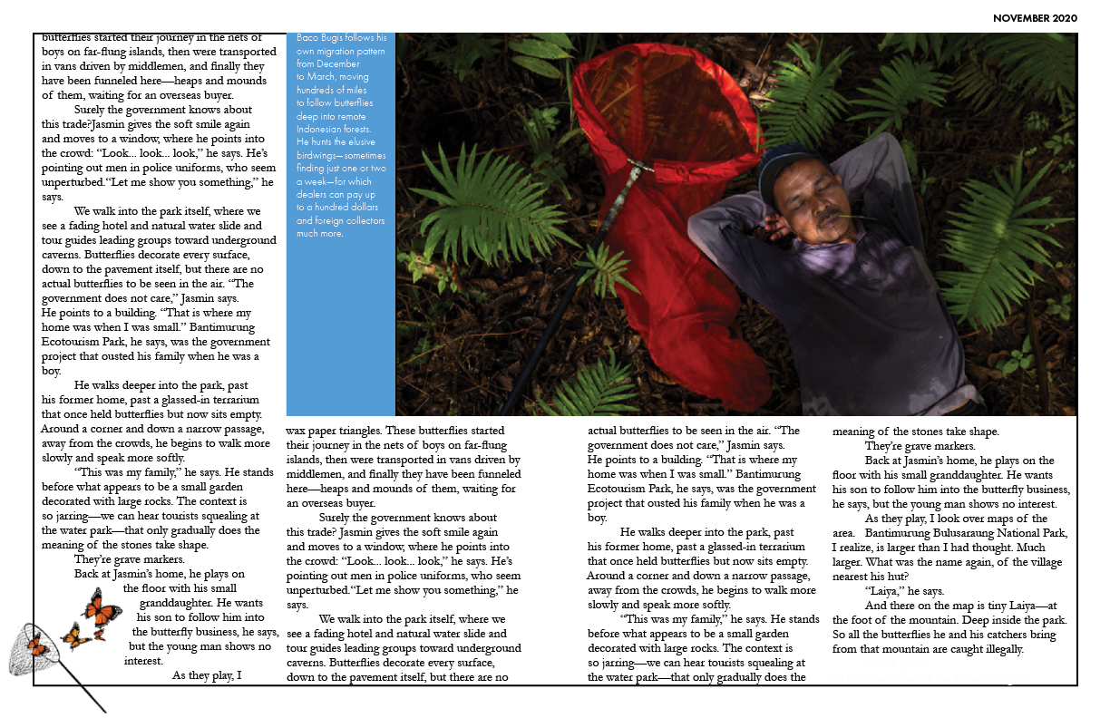
I considered all the critique I received from the prior class session and incorporated some splashes of color and more playful imagery throughout my spreads. I chose a vibrant blue as my main motif, as blue (albeit a little darker) is already present for the image of the title spread and also in the image of the butterflies.
I reformatted the subheading style on Spread 2 Page 1 to a different format that to me read as more true to National Geographic (or, as I like to put it, gave more NatGeo vibes). I experimented with blue butterflies to continue the blue motif. I Photoshopped shadows behind the butterflies in order to create an effect of them either fluttering by or flittering off the page to give the Spread some more life. However, I am considering varying the butterflies/colors of the butterflies to give it a bit more variety. For my next iteration, I’m thinking of switching out the blue butterfly on Spread 2 Page 1 to an orange one, as I feel an orange butterfly will pop better against the blue color block. I also gave one page a slightly gray border.
On Spread 3, I removed some of the photos in an effort to declutter the page. I chose the photo of the man with the red net as I felt it carried the topic of the article best, as well as continued the color story I am building throughout my spreads. I felt the red from the net contrasted nicely with the blue I chose, and also matched the red tablecloth in the background of Spread 1. I formatted this photo with the hallmark National Geographic bleed-over format.
I used blue in the subheadings and caption blocks across the 3 spreads, as my critics from last time suggested I use color to make certain parts of the text pop and give the article more life. I feel that the blue makes some of the quotes I am trying to highlight, such as on Spread 2, pop more. I added a small graphic of butterflies being netted on Spread 3, Page 1 to give it a little more pizazz. I also experimented with adding a border around the text in order to “bound” it within the page, and give the text a little bit of structure. However, I think this may detract from legibility.
Critique:
-Clean up lines on Spread 2, page 1
-Remove boundary/border lines throughout spreads for better aesthetic and legibility
-Consider playing with blue/orange color scheme for butterflies
-Move captions onto page instead of beside to clean up color
-Change the tab spacing
-Get rid of orphans
-Change font/color of quotes to black and a sans serif
-Add divider between quotes and text
-Make changes to the Spread 1 in order to increase legibility of text
(12/8) Iteration III, 1-on-1 Critique


Design Intention:
For this iteration, I worked with Anna in order to clean up the spreads while retaining and building on a sense of playfulness. Anna was incredibly helpful in assisting me to create a cleaner, more aesthetic, and more legible composition across my three spreads. I really enjoyed our session working together and was very appreciative of her patience and advice.
On Spread 1, a white background was added behind the text in so that a sense of “beginning” was created for the article. It also made the text easier to read than the prior iteration, which featured white text against the colorful image. I moved the photograph slightly to the left so that the focus of the image was still displayed nicely. I feel that the colors of the pins, blue background, red tablecloth, and butterfly work really nicely together. A picture of a Swallowtail butterfly was added onto Spread 1 Page 2, as the article begins by determining it as an incredibly difficult butterfly to catch.
On Spread 2, the butterflies were swapped out for ones of different colors to create a more diverse color palette. I went through with my decision of swapping out the blue butterfly on Spread 2 Page 1 with an orange one, and I definitely think it pops more against the blue color-blocked background.
On Spread 3 Page 1, the orange butterflies on the bottom left of the page were swapped out for blue ones in order to continue the blue motif. Because the color blocked captions were removed, I felt blue could have played a more prevalent role for this spread.
The photo captions were moved from the side/bottom of the image to instead directly on top of the image. The color blocking was a bit distracting, and its removal helped declutter the magazine pages. With the captions directly on the image, there is better readability. The small blue tab on the edge of the photo caption box was a suggestion by Anna. I definitely thinks it helps the caption pop better against the colorful image background, and builds on the blue color story.
I experimented with adding a light blue border to Spreads 2 and 3. I thought it would help balance how prominent the color white was in those spreads in contrast with the extremely colorful title spread. I tried using a very subtle, low opacity version of the blue I chose for the color block/caption tabs.

Critique (with Ji):
- Align text so that the spacing between paragraphs and pictures are the same
- The spread without the blue border is preferred; the version without the border gives the magazine spread a cleaner read and aesthetic
(12/10) Final Review


Issuu Link: https://issuu.com/carolinj353/docs/jiang_cdf_f20_p5_magazine
Design Intention:
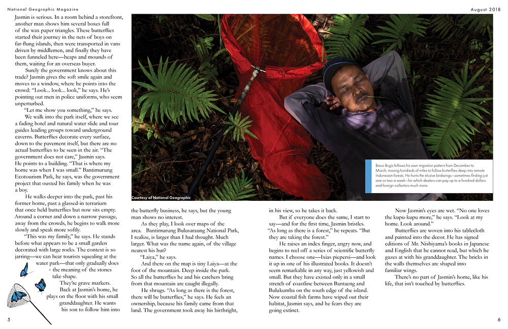
For the final critique, I cleaned up all the paragraphs, captions, and text so that the spacing between said variables were all the same. I cleaned everything up, removing orphans and aligning all the text breaks and tabs. I shifted the page number and magazine title/date formatting and played with the letting/kerning to promote cleanliness.
Critique:
-The use of the 3 dimensional butterfly imagery works nicely with the flat color blocking and gives the page life
-The photo credits could be shifted just slightly more to the right
Reflection
Project 5 was definitely the most challenging project for me, but it was also the one I was most excited for. I really loved how I could choose my own magazine and article to emulate, and definitely had a hard time picking just one. I settled on National Geographic because it was a magazine I loved reading as a kid. Being a photographer for Nat Geo used to be my childhood dream career, and I adored the idea of getting to create a spread for a magazine that I feel is a piece of my childhood.
I loved how, as we progressed through each project, we became equipped with skills that directly benefitted us for the upcoming project. Project 5 felt especially exciting in this sense, as it was a manifestation of the gestalt of all the skills we’ve acquired over the course of the semester. As with all projects, I really loved seeing the different ways my peers approached the challenge. Throughout the course of the semester, working with and accepting critiques was something I was fond of, even though the concept seems a bit intimidating in the beginning. As I got to know my classmates better, I found myself learning more about and remembering the special aesthetics and trends of different people. For example, I noticed and loved how Sean’s designs always displayed elegance and clear attention to detail. Adrianna always used color palettes and graphics that I felt were really effective. Gloria’s approaches were always playful and played a role in inspiring my own work. Biff always chose topics for projects that were unique and creative, and her peer review critiques throughout class were always encouraging and helpful.
I’m incredibly thankful for the time I’ve had with Anna, Ji, and my classmates in this class. I still remember emailing Anna pleading to be added to the class despite the enormous waitlist and being so appreciative and thrilled when she accepted me. This class has not only furthered my understanding about the process and components of effective design, but it’s also helped me build my passion for it and taught me to take inspiration from my peers. My teachers and peers were always so kind and supportive of each other’s creations, and that in it of itself was invigorating and inspiring. People will always approach and see things in different ways, and unique perspectives are such an alluring and lovely aspect of design and life.
