Communication Design Fundamentals
Project 3 | Type Specimen Poster
The physicality of the chosen typeface can set the tone for and completely change the interpretation of a passage. Learning about what makes a suitable typeface for different environments and situations is crucial aspect of a designer’s skillset.
Part I: Typographic Voice Exercise (9/24/20)

Exploration
Melancholy |sorrowful, tristful, forlorn
I chose the word “melancholy” in part because of its elegant composition, and in part because I thought this word was one of the more difficult ones in the set. The appearance and quality of a typeface creates an ambiance for its reader, and thinking of what typefaces inspire a feeling of sadness was difficult. I wanted to tackle a challenge.
In my exploration, I typically strayed towards serif fonts as I felt they were better suited for setting a somber tone. I strayed towards typefaces with shorter x-heights and some kerning, so the letters felt small and separated from each other, which would in turn better manifest a sense of disconnect and forlornness. I experimented with some script and slanted fonts in order to see if giving the typefaces a slant or “droop” would better communicate sorrow. Lastly, I tried out gothic-style typeface, as stereotypically they are associated with a darker period of history, such as the medieval era.

Refinement
Poor Richard: This serif font features a bolder type, which gives it a feeling of being “heavier.” Fairly spaced out kerning in addition with the shorter x-height makes the letters feel small and lonely.
Eras Light ITC: In contrast with the other chosen typefaces, this one is sans serif with a lighter weight and taller x-height. The lighter weight almost gives it a feeling that it might disappear, or blow away, which is fitting for “melancholy.” The stress axis is tilted, giving it a sense of “droopiness.” I chose this font as a foil to the formula I was using in picking the other typefaces, as I felt this could be a contrasting typeface that would be able to convey “melancholy” accurately.
Rago Italio: This typeface was chosen for its messy, handwriting-like quality and curved axis, as well as its heavier weight. I imagine a writer dragging their pen across paper with a heavy hand, expressing their sorrow.
Microsoft Uighur: Similar to Poor Richard, this typeface was chosen for its qualities of smallness and loneliness. The small x-height makes the typeface feel quiet and voiceless, and therefore connects it to melancholies.
Blackadder ITC: Similar to the aforementioned typefaces, Blackadder ITC emulates droopiness through its slant and grief/heaviness through its weight. The tails on the ascenders and descenders, as well as the “shaky” and uneven/asymmetrical appearance of each letter, give it a sense of unsureness and dread.
Typeface Research

Designer: John Baskerville (1754)
Description:
Baskerville is a serif typeface designed in the 1750s by John Baskerville (1706–1775) in Birmingham, England, and cut into metal by punchcutter John Handy. Baskerville is classified as a transitional typeface, intended as a refinement of what are now called old-style typefaces of the period.
Compared to earlier designs popular in Britain, Baskerville increased the contrast between thick and thin strokes, making the serifs sharper and more tapered, and shifted the axis of rounded letters to a more vertical position. The curved strokes are more circular in shape, and the characters became more regular. These changes created a greater consistency in size and form, influenced by the calligraphy Baskerville had learned and taught as a young man. Baskerville’s typefaces remain very popular in book design and there are many modern revivals, which often add features such as bold type which did not exist in Baskerville’s time.
Baskerville’s typeface was part of an ambitious project to create books of the greatest possible quality. At a time when books in England were generally printed to a low standard, using typefaces of conservative design, Baskerville sought to offer books created to higher-quality methods of printing than any before, using carefully made, level presses, a high quality of ink and very smooth paper pressed after printing to a glazed, gleaming finish.
- Wikipedia
While it found little success during the lifetime of John Baskerville, the typeface made a huge influence in Europe after the printer’s widow sold the Baskerville punches and matrixes to France, where it circulated among foundries.
- idsgn.org

Type Specimen Poster Sketches

Part II: Typographic Hierarchy (9/29/20)
Typeface: Arial


Line spacing is used to organize and bundle information for higher clarity. Details about each seminar are grouped together and separate from information about other seminars to promote legibility. The reader will interpret each cluster as information regarding that specific lecture.
The left exploration features more line spaces, which separate groups of information into subsets. For example, “Carnegie Mellon,” the name of the school, is separated from “Human Interaction Institute,” which is the department. “Rashid Auditorium / Carnegie Mellon Campus,” the name of the building, is separate from “500 Forbes Ave,” the address. Separating the material into subsets may help the organization of the poster and allow for the reader to better categorize information.
The right exploration features less line spaces to prevent too much separation, which may allow the reader to locate the information they are looking for (for example, a specific seminar) faster. Sentences are also less broken up, which may allow for better flow of internal monologue. Arial Narrow is used, which may promote faster reading or give the poster a more professional feeling.


Altering both the weight and line space can help categorize passages by a bolded word and/or emphasize more important information.
The left exploration seeks to group the information by date. The use of Arial Bold in juxtaposition with Arial Narrow gives the text higher contrast, thus making the bolded information pop out more. The original text had the date listed first, and thus this exploration categorizes each seminar by the date they occur. The date is what catches the reader’s eye first, which can help someone who is looking to see when they are available to attend a lecture.
The right exploration seeks to group the information by lecture. Although the date and speaker occur first chronologically, the bolded lecture name draws the eye towards that specific line in each grouping. This exploration can be more effective if a reader is browsing through the upcoming seminars to see which one they want to attend based on interest in the subject.
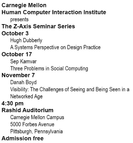

Altering the weight and indentation of a text gives makes it more visually complex and can allow for further sub-categorization of information.
In the left exploration, Arial Bold is juxtaposed with Arial Narrow for higher contrast and promote the perceived weight of the bolded text. The leftmost margin has the “leading” information first, or the piece of information which the indented information falls under. In this case, it is the date. The date catches the reader’s eyes first, and the speaker and lecture topic are subsets of the leading category. Each type a new type of information is presented, the margin “restarts” in its leftmost position and the text is bolded.
The right exploration follows a similar concept as the left, but seeks to break down information even further. As the margins travel right, the information gets more expensive. For example, the leftmost margin is the most general: its categories are the school/department name, the seminar series, and the admission price. It separates information by the most inclusive categories. The middle margin shows information that is subset of the seminar series, such as date and speaker. The rightmost margin features the seminar name, which is separated so that the reader can browse by name OR date based on their needs.
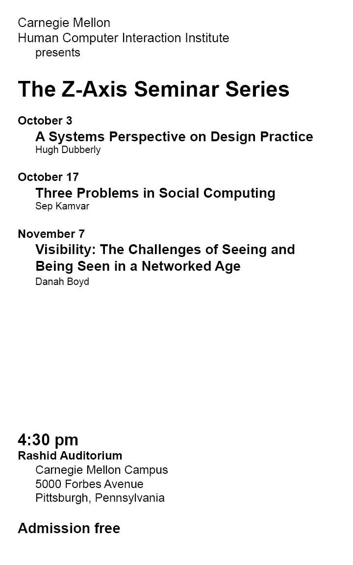
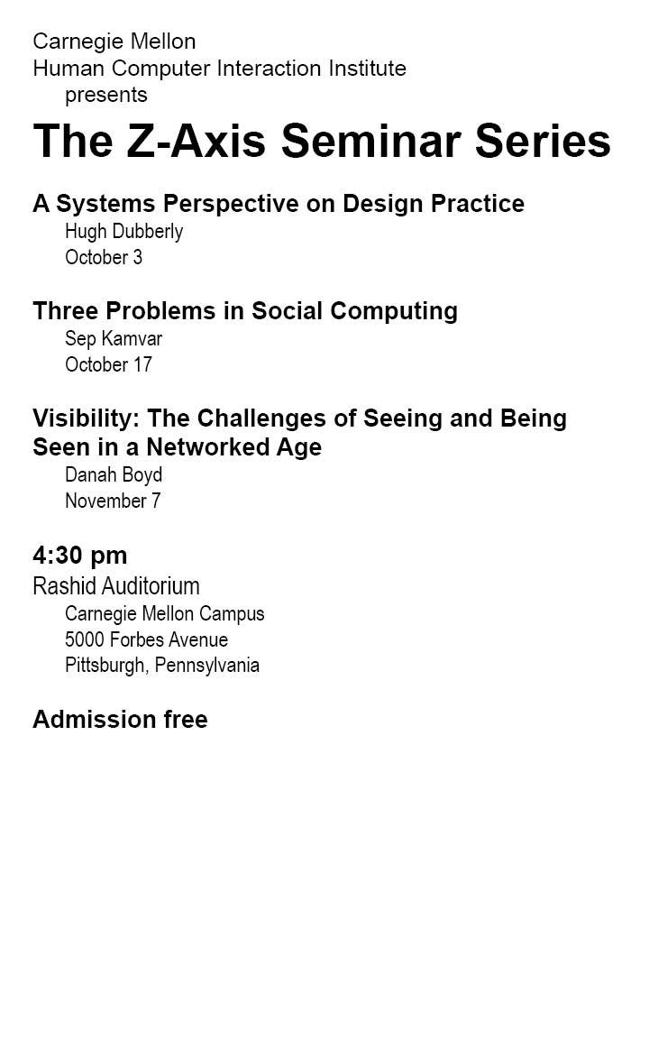
Altering size change in combination with line weight in addition to adding some of the features previously explored allows for the most effective categorization of information.
The title of the seminar is the most important piece of information on the poster: it describes all the information which the poster is regarding. Thus, it is bolded and also the largest, most legible piece of information on the poster. However, its placement still comes after the school name/department, as it is still a subcategory of/being hosted by that department of Carnegie Mellon.
The left exploration does not change the order of the original text, opting to sort the information by date. Although the date is the left-most margin and bolded, the name of the lecture is also bolded, and larger than the date. This is because the topic of the lecture is arguably more important than the date. The date and place are separated from the contents of the lecture for formatting purposes; it takes up some of the vast white space towards the bottom of the poster. The time is emphasized over the place, as perhaps it is easier to forget the time than it is to forget which auditorium it is in (as Carnegie only has so many!). The address is then written narrower and underneath that, since if a reader already knows the auditorium by name, the address is irrelevant information.
The right exploration rearranges the text so that the name comes first. This allows for easier browsing by topic, and perhaps makes the poster eye catching as it highlights the most interesting part of the seminar to the reader. Therefore, it may be more effective in capturing the attention of someone who is an interested in a certain lecture topic in comparison to spotlighting the date.
The only exploration that was not investigated was categorizing the information by name, but perhaps it was my personal bias as I am unfamiliar with the speakers. If the speakers are prominent figures, I would put more emphasis on them so that the poster better attracts readers and does a better job promoting the seminar series. Since I am unfamiliar, I opted to promote the topic as the most interesting and attention-catching feature.
Poster Drafts (9/29/20)


(Week 1) Explorations: Set I
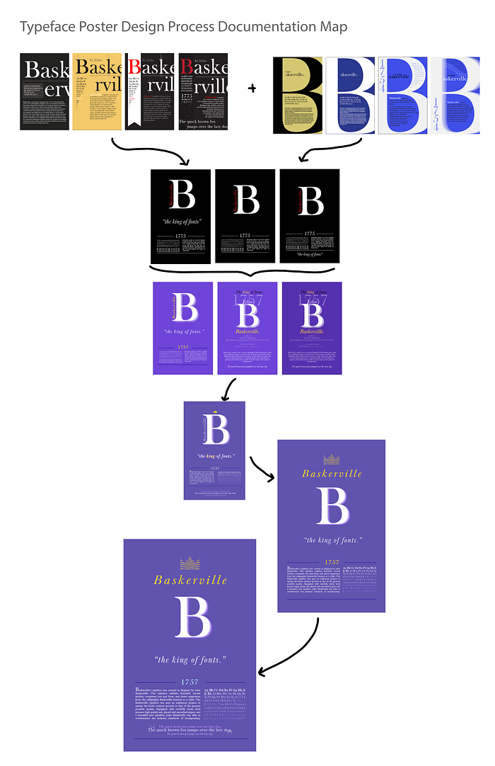
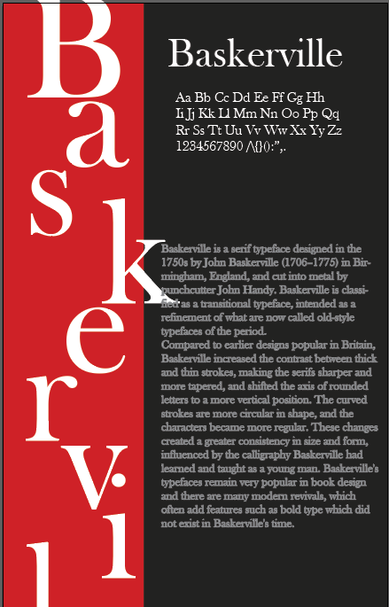
Baskerville is a typeface with a regal and elegant persona. I tried to embody this through the color schemes, opting to utilize stark contrast and white text against dark/color background to exhibit this.
In Poster I, I opted for a more simplistic design that didn’t showcase the entire name of “Baskerville.” I did this because I wanted the typeface to feel more “iconic” in the sense that the viewer would know the name of the typeface without the whole thing being spelled out — the same way a famous company can be recognized through its color scheme or logo, even if its name isn’t spelled out. However, choice could be ineffective because it takes away from the informative goal of the poster.
I also wanted to format the typeface poster in a book-cover-esque fashion in order to allude to the typeface’s history, which regards book printing.
In Poster I and III, I experimented with a red banner in order to further emphasize elegance and boldness, in addition to giving it a little edge and flair. However, the color choice may be inappropriate, as it may interfere with the traditional feeling of the typeface.


(Week 1) Explorations: Set II
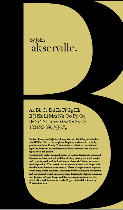
For Set II, I explored poster designs in which the “B” in Baskerville was blown up and emphasized. I continued the trend of high contrast and dual tones. This time, I chose to use some brighter colors in order to give the poster more life.
I feel that more clarity and separation is needed between the information of the text, as it may be difficult to read.
Feedback (Anna & Ji):
- Typeface name should be more legible
- Cleanliness; some things are overlapping/go over the edge of page
- For Set III, “askerville” reads separate from the B; there needs to be more conformity
Poster Draft Refinement (10/1/20)


(Week 2) Explorations:
Poster I shows the original black/gray-and-white poster was reformatted in order to give it more flavor. A “border” was added to the left side, which I then used the pen tool to push up in order to make it resemble a bookmark. This alludes to Baskerville’s book-printing origin story. However, this design choice can also come across as corny and misrepresentative of the typeface’s elegance.
Poster II takes the format of Poster III but utilizes a different, brighter color palette. It eliminates the drastic, sharp-colored red used in the first poster in order to remedy the “corniness.”
Poster III is an iteration of the template of Week 1 Set II Poster I. The color in the back is toned up to be brighter, giving the poster a more modern feel while still trying to represent Baskerville’s traditional origin through its ornate and elegance.
In all posters, I tried to represent hierarchy by always having typeface names be the largest and most eye-catching text on the page, either through sizing, centering, or color. I want the reader’s eye to then be drawn to the character set or year, before reading the information. However, I realize that this may not be the case, as, for example, the year in Poster I and II are definitely not as legible and eye-catching as they should be.
Feedback (Group Critique):
- Character set is a little bit oddly placed; this could be cleaner
- Information about typeface can be more legible and more neatly placed
- Shapes shouldn’t be used (eg, the “bookmark” of Poster I)
Poster Draft Refinement (10/6/20)
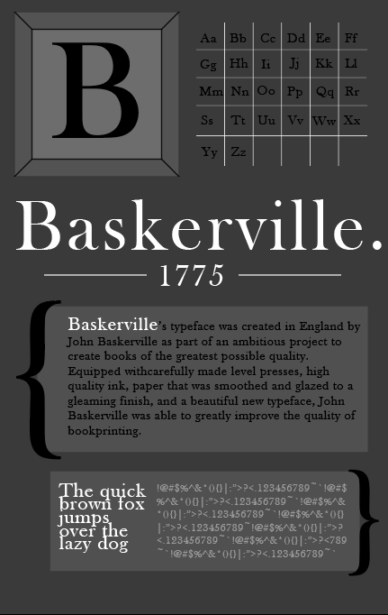
(Week 3) Explorations: Set I
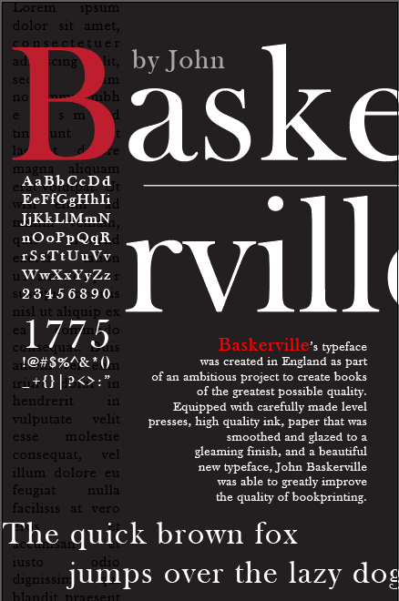
W3 Set I Poster I tries to remedy some of the issues from its previous iteration (see: W2 Poster I) by toning down the red and replacing the bookmark with text box of darker type to add dimension. However, it still fails in terms of orderliness and cleanliness; the poster feels very busy and outdated.
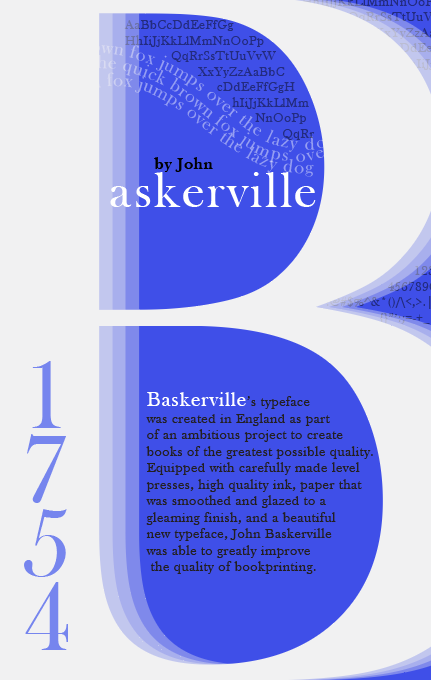
Poster II is an iteration of a previous rendition (see: W2 Poster III). The large white B is stacked on top a series of white Bs with decreasing opacities to add dimension. The year of creation is brought down to the bottom left to help balance some of the poster’s weight. The character set is placed into the background in order to add dimension. In the top pocket of the large B, “askerville” is pushed more towards the left and made the same color as the B so that it the typeface name reads more coherently.
Poster III is a first attempt at a poster that references Baskerville’s printing press history more directly by placing the B within a printing-press-key-like border, and the character set in a printing-press-like format. However, it violates some of the basic assignment rules with no real improvement in typeface representation.
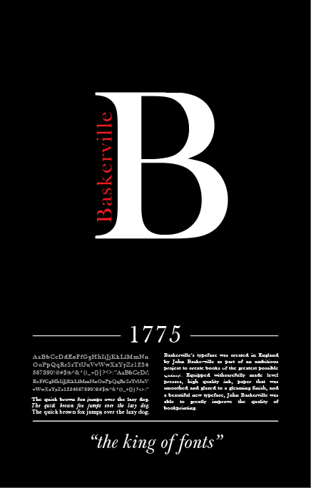


(Week 3) Explorations: Set II
Set II explores an entirely new design formatting. I wanted to continue to represent Baskerville with its capital “B,” which I thought was an iconic aspect of the typeface. I combined this with the black/dark gray and red color scheme I used in my Week 1 explorations.
My previous renditions all felt very cluttered and disorganized; I rectified this by incorporating a much larger amount of white—or in this case, “black” — space. I thought the black color created by the empty space could almost speak louder than had it been filled by anything else. The quote, “the king of fonts” was chosen to invoke the same regality and elegance that I was struggling to produce in my previous designs.
The hierarchy of these posters also felt a lot more deliberate; the typeface name and the typeface “logo” (the capital B) is centered up top, and the name is the only text on the poster with color.
Feedback (Anna & Ji):
- Set II designs are more effective than the prior
- Perhaps try a different color scheme; current one is dark and simple, but Baskerville’s regality can be represented better with other colors
- Try purple for the background, as helps promote the regal image I’m trying to project
- Play with the orientation of “Baskerville” to help with hierarchy, as the typeface name should be the most important piece of information on the page/read first
Poster Draft Refinement: 10/8/2020

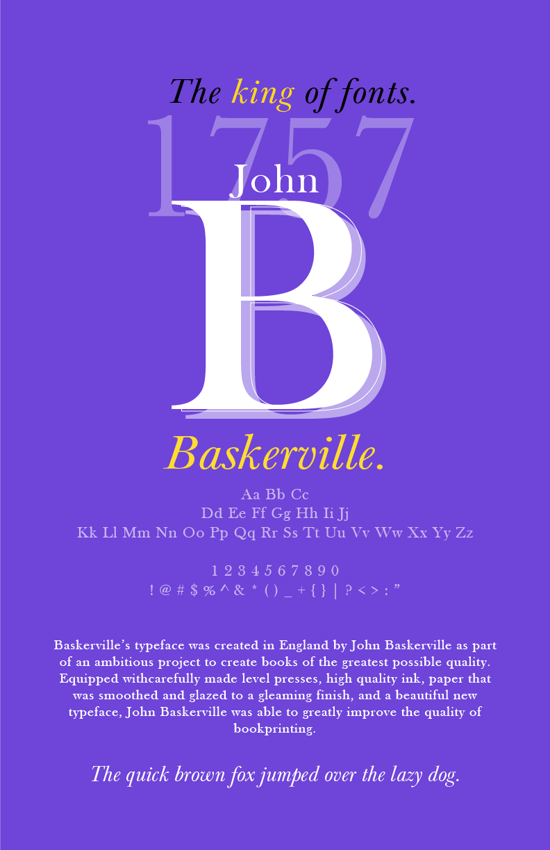

(Week 3) Explorations: Set II Cont’d
The hierarchies of these posters feel much more deliberate to me than my previous renditions, which I think is a positive accomplishment regarding something I was struggling on. The formatting feels much cleaner and more legible. For example, when these posters are compared to my Week 2: S1 P1, I believe these posters feel more graceful.
I incorporated feedback provided from the previous session, and changed the color scheme to purple and yellow to showcase regality. However, I also wanted my typeface poster to feel modern and thus relevant to potential readers, and was struggling to balance this goal while still representing the traditionality of an old 18th-century typeface. I attempted to do this by choosing a bright, electric purple rather than a true royal purple for the background. I also tried a more toned-down purple, as seen in Poster III, as I wanted critique on if the bright purple felt too “plasticky.”
Poster I builds on almost the exact format as used in Week 3’s previous renditions, as I felt the hierarchy for those was effective. However, I also tried a different hierarchy that was a little more dimensional and perhaps had more similarities with the formatting the inside cover of a book.
Feedback (Anna, Ji, & group):
- Poster I design is more effective
- The weight and/or color of the character set should be promoted so that it is more legible, and distinguished from the paragraph on the right
- Try making “Baskerville” white or dark blue instead, and repositioning it so that it is more blatant than the “B”
- Be careful of the spacing of the informational paragraph
- Make sure margin spacings are symmetrical
- The yellow used in the color scheme should be more gold-toned
- Clean up the stack of “B”s
Poster Draft Refinement: 10/13/2020
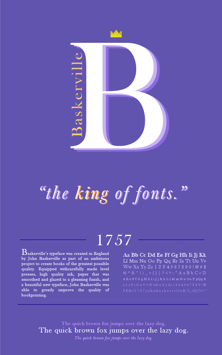

(Week 4) Explorations:
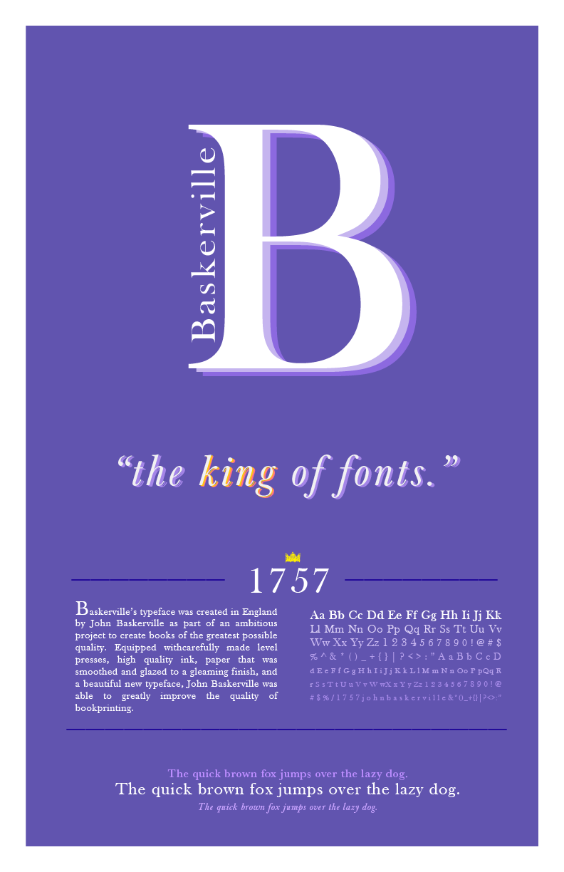
In these renditions, I listened to the advice giving during critique and played around with the orientation as well as the color of the typeface name. Many of my peers expressed that the color used felt over-the-top and too bright; I responded by toning it down to a truer, but also more blue-toned royal purple. I used the characters set to create a miniature “crown” symbol that keeps within project guidelines. I thought this would give the poster a little bit of a playful touch, while also building on the dimensionality by using a bit more of color. I cleaned up the stacked “B” in the center of the page, fixing the alignment and opacity.
I added a character set sentence at the bottom so that the bold and italicized versions of the typeface could also be represented.

Feedback (Anna & Ji):
- Increase font size of the characters in the crown so that it is more legible. Consider turning into a character set
- The “line” in the B can be distracting
- Consider deleting the character set sentence at the bottom, as it does not feel deliberate and more of an afterthought
Final Submission: 10/15/2020

Notes on Final Critique:
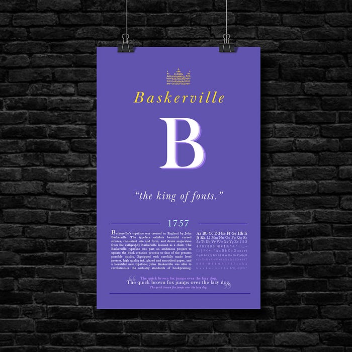
In my final rendition, I tried to follow all advice from Anna & Ji, as well as from the group critique sessions. In an earlier critique, Anna suggested a blue/white color for the typeface name. I felt that yellow would suit the typeface name best in this case, as it would match the crown for the regality theme. So, I decided to incorporate that critique into the color of the year instead. I received critique from Ji that the character set sentence at the bottom didn’t feel deliberate enough; in response, I tried to make it feel more deliberate by playing further with the formatting and embellishment. However, looking back, I realize that the information presented is redundant, and I believe simply eliminating those 3 sentences could make the poster more impactful.
My hierarchy and formatting, as well as poster legibility and representation, felt much more deliberate and successful to me than from when I began. However, after group critique, I realize there are still some fine-tuning steps to take in order to bring this poster to its full potential.
Further Exploration:

Reflection (10/16):
Designing something that is meant to communicate and represent something, such as a typeface, accurately is a complex and multidimensional process. Designing a typeface poster is not something I’ve ever done before, and the process — although intimidating and a bit difficult at times — was something new, exciting, and fun.
This project taught me a lot about the considerations behind designing something that is meant for the use of other people. (In this case, a typeface poster is meant for the poster designer to represent their work, as well as the audience to make them interested and inform them about the typeface.) It has made me think about the everyday objects that I use and how many countless hours of consideration and design thinking has been put into its creation. It has also made me realize the less I think about using something, the more effective its design is, as it has been specifically made for it to be easy and intuitive to use.
A big part of this project was group and one-on-one critique. This was definitely one of the most enjoyable aspects. It was really thought-provoking and unique to see how distinctive everyone’s ideas were and in what different ways people approached the same challenge. Having my work be perceived and critiqued on by the same general audience that a typeface poster would be meant for made the design experience even more genuine. Interacting with fellow studio members to mutually improve on our design thinking and build ourselves up is something truly special about this class.
Additional Documentation:
